

This is the second in a series about the importance of properly formatting company documents and best practices.
It doesn’t matter how important the content of your document is if it isn’t readable. The longer it takes to read and understand a document, the higher the cost. When formatting is poor, it is easy to lose interest or get frustrated.
By contrast, good formatting allows readers to follow, understand, and find the information they need, and stay engaged. Effective document design improves readability (to reach your audience) and usability (to achieve your goal).
The basics
Design features should make reading your document feel easy, clear, useful, and efficient. Vary document formats based on the client, the content, the audience, and the desired goal.
In designing a document, you must
- Define the document’s goals and objectives.
- Understand your target audience.
- Choose design features that best serve those goals, objectives, and audience.
Consider how layout, formatting, and visual tools help you connect with your readers and communicate your message. Your audience will better understand visual appealing documents.
Most readers glance over a document to try to find the information they’re looking for, rather than reading the entire thing. As their eyes move quickly down the page, they notice visual content cues. To make your document more effective, provide cues that promote skimming.
As a baseline, documents typically include the following visual cues:
- Headings: A clear structure and hierarchy of content
- Fonts: Easy-to-read, 11- or 12-point for body text, sometimes smaller in tables
- Spacing:
- Line spacing: About 1.2, extra spacing above and below paragraphs
- Margins: Ideally 2 cm left, right, bottom, and 4 cm top, depending on header
- Lists: Appropriate use of bulleted and numbered
- Visuals: Appropriate use of tables, graphics, and photos
- Bolding: To emphasize key words and phrases
- Quotes: To reiterate messages
The result is easier to read, comprehend, recall, and assess.
Organization
Show your readers how your document is organized with
- A table of contents at the beginning of longer documents
- Headings
Headings may be written as
- Questions – “What are two types of automobile engines?”
- Phrases – “Two types of automobile engines”
- Declarative sentences – “There are two main types of automobile engines.”
These devices improve readability because they make it easier for readers to scan and find what they want and less intimidating by dividing content into sections.
 Typography
Typography refers to fonts and other visual elements in a document, such as bolding, bullets, italics, and underlining.
Use typography to increase readability and emphasize words and phrases, for example you might:
- Bold items as they appear in an interface, when writing user instructions.
- Italicize new terms.
- Underline cautionary statements.
Serif vs Sans Serif Fonts
Traditionally, serif fonts were considered more readable in paragraph form on paper. However, more recent research suggests that serif fonts are less readable for people who have visual impairments or disabilities. Sans serif fonts are considered more readable overall on a screen. [2] That’s one reason for Microsoft Word changing its default font from the serif Times New Roman to the sans-serif Calibri.
Visual Tools
Use visual tools to help explain your content. Effective tools match your content and the needs of your audience.
- Infographics can provide a supplemental representation of
- Data
- Ideas
- Relationships
- Tables
- Show complex information in a way that’s easier to understand.
- Show relationships and comparisons without using a lot of text.
- Lists
- Group similar items
- Can be ordered (with numbers or letters) or unordered (with bullets)
- Are easier for readers to skim than paragraphs
- White Space breaks up blocks of text using
- Headers
- Lists
- Margins
- Space between sections
Other types of visual tools include
- Charts
- Checklists
- Inserts
- Maps

Four Types of Reader
Not everyone reads through content in the same way.
Consider the following four types of readers:
- Scanner
- Skimmer
- Intensive
- Extensive
Scanner
Scanners use quick eye movements to search for specific information.
Skimmer
Skimmers read and look over structural items and infographics that provide visual cues to the deeper content. They may not read in order from start to finish, but skim to get an overview of the topic. They may read certain sections, possibly the full document.
Intensive
The intensive reader notices details, vocabulary, and makes notes. They read the whole document carefully and thoroughly.
Extensive
The extensive reader enjoys learning, discovery, does additional reading, and research. They read the content, stop to clarify what they don’t understand, discuss it with others, take notes and summarize. They go beyond the document and read extensively for enhanced understanding.
Conclusion
Was this article easy to read? We hope so; we used simple formatting for easy readability. Of course, this type of formatting is not applicable to all documents. Depending on the use of the document, paragraphs may be longer, or you may only use page headers. Don’t forget to break up all that text with white space, images, and even charts or graphics if appropriate.
Do you need a technical writer for a big project, but don’t need to hire one full-time? Contact us today about our experienced technical writers!
Related Blogs
Why Document Formatting is Important
Why Document Formatting is Important: Lists
Why Document Formatting is Important: Headings
References
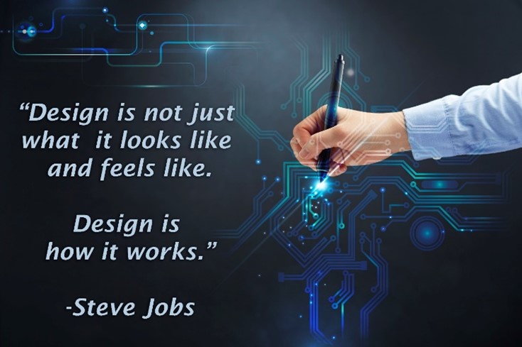
Jobs, Steve. Quotes on Design. Accessed 8/30/22. https://quotesondesign.com/steve-jobs/